🖌️ Format Diagram
The Format Diagram menu is your creative control center. Here you can adjust the visual appearance of your mind maps and flowcharts – from individual colors and fonts for single nodes to global 3D design settings like transparency effects, color schemes, and background images.
🛑 Important preliminary note: The formatting menu is context-sensitive!
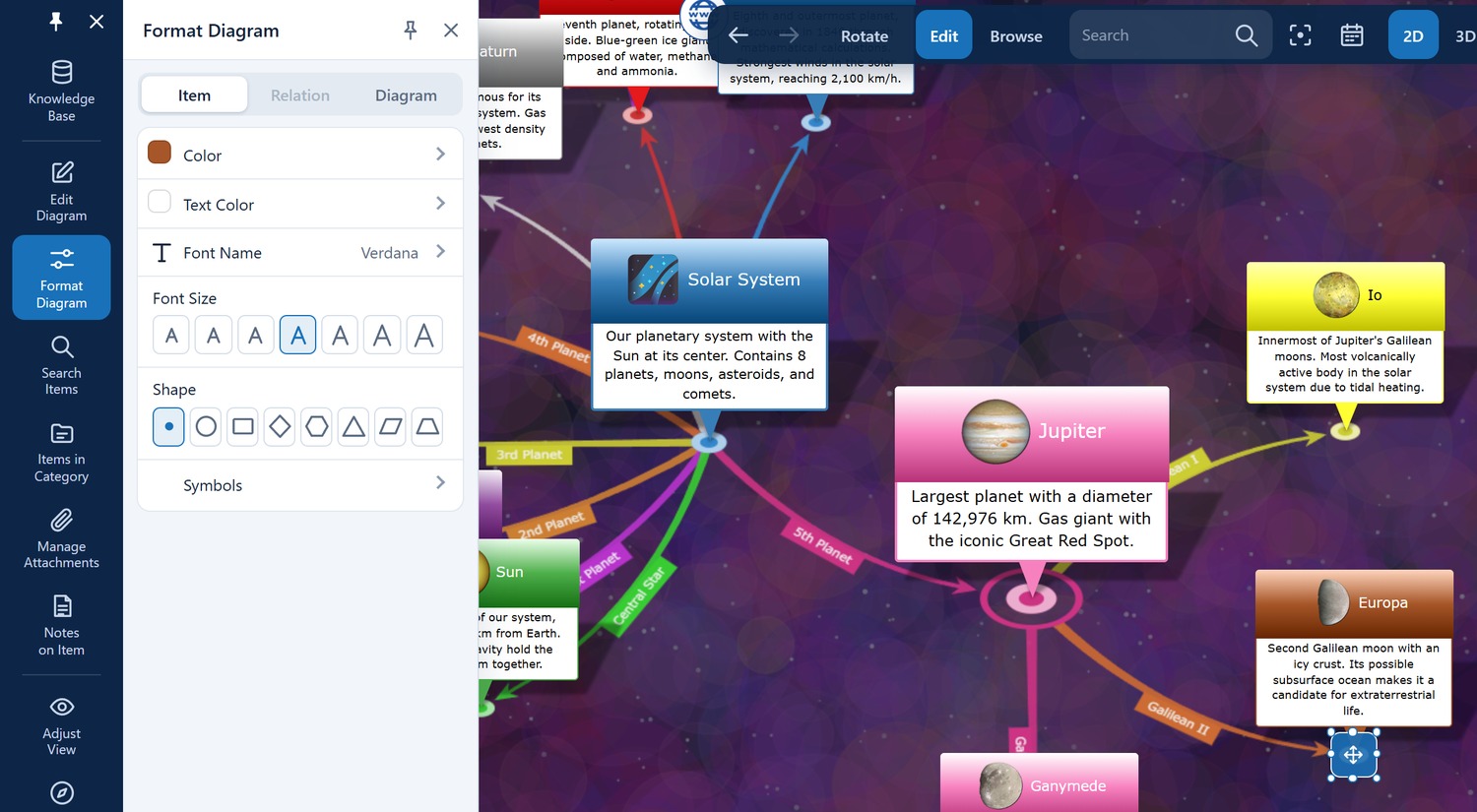
Before you can meaningfully use the entries in the Format Diagram menu, you must first click (select) the desired item or relation line in the diagram. Only when the object is selected do the corresponding properties (such as item color, font, or line style) become visible and adjustable in the left menu!
🔗 Item & Relation (Individual Formatting)
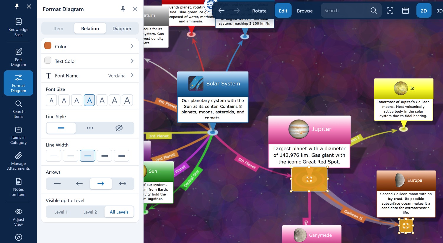
When you select an item or a relation line in the diagram, you can adjust its specific design in this upper section.
- Color: Changes the background color of the currently selected item or the color of the selected relation line. If the item belongs to a category, the color of the whole category changes – all of its items change along with it. The same goes for text color, font and shape.
- Text Color: Sets the color of the label (text).
- Font Name: Allows you to change the font for the selected item.
- Font Size: Adjusts the size of the label (e.g., useful for visually highlighting main categories).
- Line Style: Switch between solid, dotted, or invisible lines. Pro tip: Invisible lines are great for letting items float visually freely in space while keeping them logically connected.
- Line Width: Determines the thickness of the selected relation line (from very thin to very thick).
- Arrows: Determines if and where arrowheads should be displayed on the relation lines (Start, End, Both sides, or None).
- Visible up to Level: Controls up to which relative hierarchy level the selected item or line should remain visible when you browse through the diagram.
🗺️ Diagram (Global Design Settings)
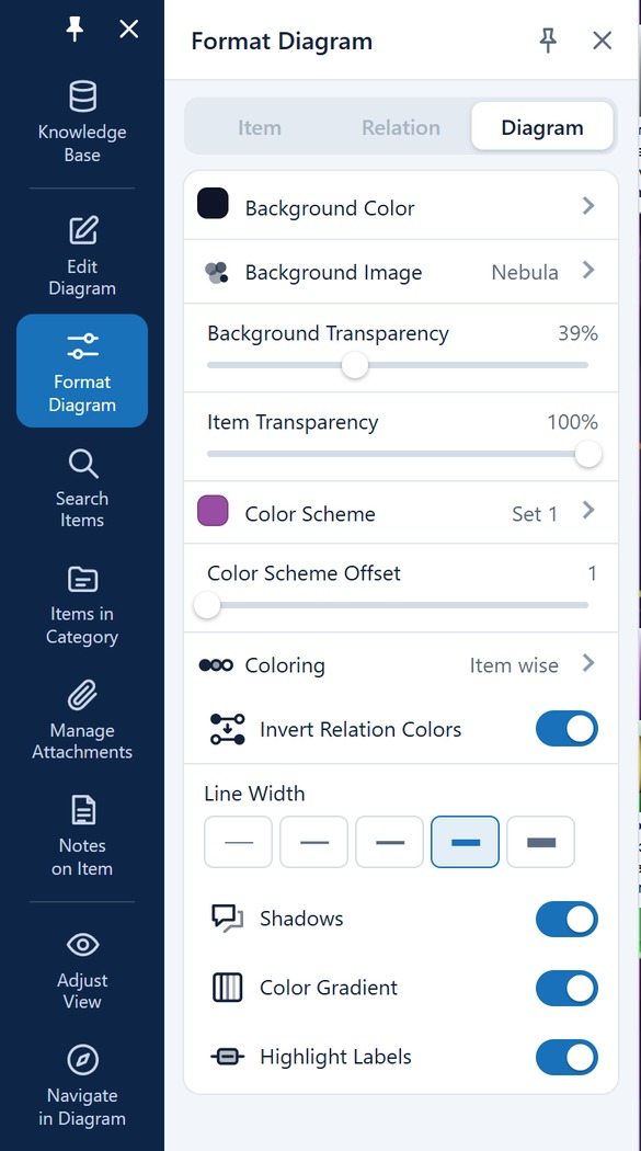
In this section, you define the global look of your entire knowledge network. Changes made here affect the entire displayed diagram.
- Background Color: Sets the color of the 3D space or the drawing canvas. Pro tip: Set the color to black to activate an eye-friendly "Dark Mode" for the diagram!
- Background Image: Opens a gallery of ready-made backgrounds – see the next section. Use Select Image... to pick an image of your own from the attachments stored in the database. Pro tip: The entry Image from Root Item instead uses the image assigned to the currently selected root item automatically, so the background changes as you browse through the network.
- Background Transparency (Slider): Continuously determines (from 0% to 100%) how strongly a set background image should shine through.
- Item Transparency (Slider): Makes the nodes (items) semi-transparent. This is especially useful in 3D mode to keep complex networks clear and to let underlying relations shine through.
- Color Scheme: Choose from over 20 professional, pre-made color palettes (such as spectral colors, pastel, accent, or blue-green gradients) to color your diagram harmoniously and attractively with just one click.
- Color Scheme Offset (Slider): Shifts the starting point of the applied color palette. This allows you to fine-tune the color distribution until the result is perfect for you.
🖼️ Background Patterns
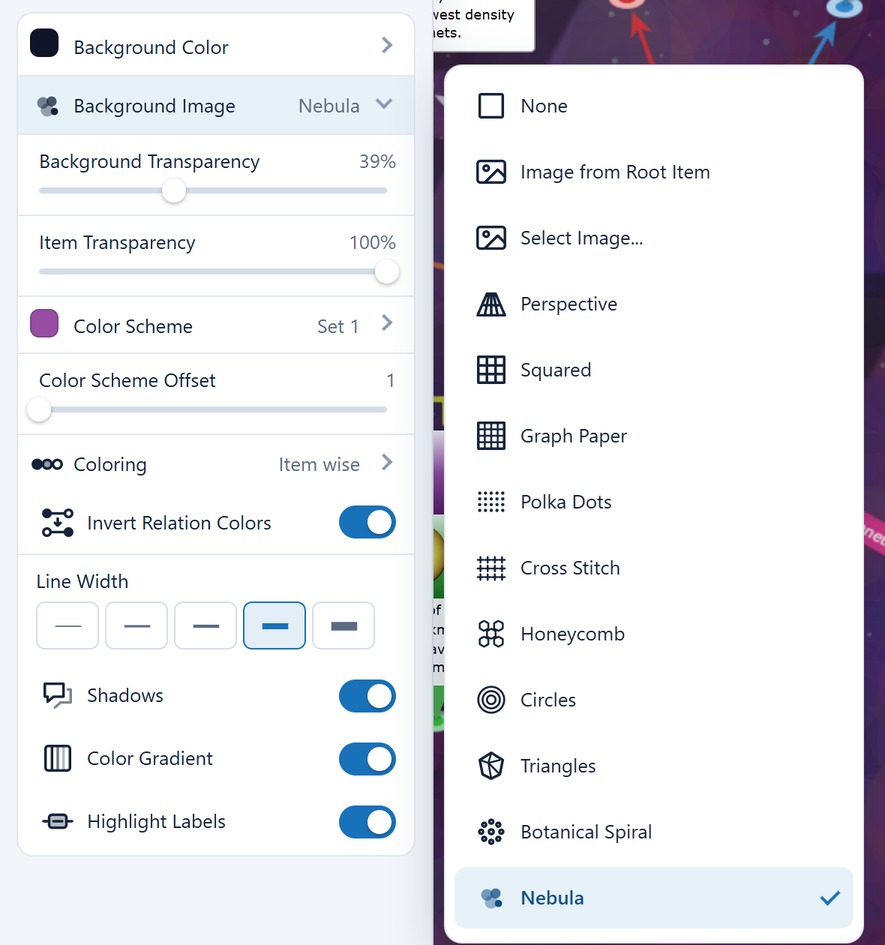
Background Image is not just a file picker – it opens a gallery of ready-made backgrounds. Which entries it offers depends on the view you are in, because a flat pattern makes no sense in three-dimensional space.
In the 2D view
| Entry | Background |
|---|---|
| None | Plain background colour, no pattern |
| Image from Root Item | The image of the current root item; it changes as you browse |
| Select Image... | A fixed image of your choice, taken from the attachments in the database |
| Perspective | Perspective dot grid – the default |
| Squared | Squared paper |
| Graph Paper | Fine millimetre grid |
| Polka Dots | Evenly spaced dots |
| Cross Stitch | Small crosses |
| Honeycomb | Hexagonal honeycomb |
| Circles | Circles along the edges |
| Triangles | Triangular mesh |
| Botanical Spiral | Phyllotaxis spiral, as in a sunflower head |
| Nebula | Coloured circles of light – decorative, best with a dark background colour |
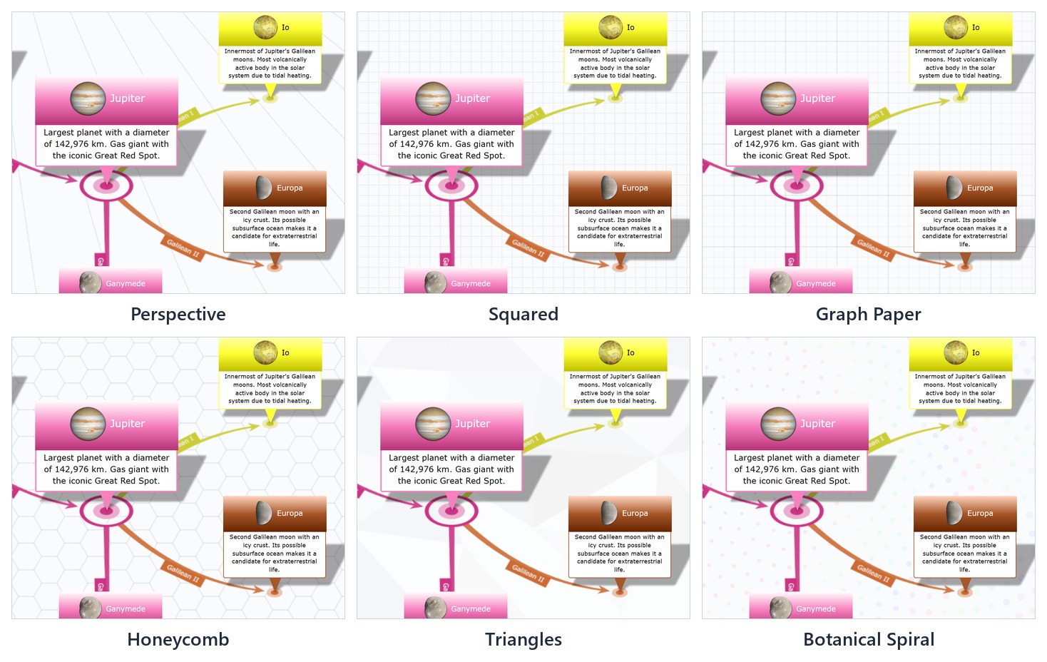
In the 3D view
The flat patterns disappear and two spatial backgrounds take their place:
| Entry | Background |
|---|---|
| None | Plain background colour |
| Image from Root Item | As in the 2D view |
| Select Image... | As in the 2D view; the image is projected onto a surrounding sphere and thus acts as a backdrop |
| Grid Floor | A grid drawn as a floor plane under the network |
| Starfield | Stars in space |
The 2D and 3D views remember their pattern separately. You can therefore use squared paper in the flat diagram and show the very same diagram against a panorama image in space.
The background colour, however, applies to both views at once — with a twist that catches people out. As long as the colour is set to Automatic, the 3D view switches to a dark night sky by itself as soon as Starfield or Grid Floor is chosen; stars on white would not be visible. But the moment you set the background colour yourself, your choice wins — in space as well. If that colour is a bright white, the starfield sits in front of a bright surface and looks as if it never arrived. So for a dark starry sky, either leave the colour on Automatic or set it explicitly to black.
Tip: The Background Transparency slider right below the gallery controls how strongly the chosen pattern or image shows through. Turn it down when the background competes with the items for attention.
🏞️ Choosing your own background image
The entry Select Image... opens the Select Background Image dialog. It shows every image stored as an attachment in the database, as a grid of tiles with a preview and the file name.
- Click a tile to mark the image. A double click applies it right away.
- Confirm with OK. The image then fills the drawing canvas completely and stays in place while you browse.
If no suitable image is there yet, the Import button leads straight into the familiar attachment import. Once the import has finished, the selection returns on its own – the new image is already marked and only needs to be confirmed with OK.
Choosing a different image later: simply click the already selected Select Image... entry again; the dialog reopens with the current image marked.
There is a second route through the Manage Attachments panel: in edit mode, hover over the row of an image and click the ▨ Use as background image icon.
Note: The background image is a property of the diagram and does not have to be attached to an item. Attachments that serve only as a background therefore appear in the attachment repository with a reference count of 0 – that is not an error.
🎨 Coloring (Automatic Color Assignment)
This powerful tool determines the logic by which the system distributes the colors from the selected color scheme to your nodes. Choose from the drop-down menu:
- Item-wise: Each item is individually assigned its own color from the palette.
- Level-wise: All items located on the same hierarchy level (distance from the root item) receive the same color. This is highly recommended for making complex structures instantly visually comprehensible.
- Parent-wise: Child items automatically inherit the color of their direct parent item, creating visually cohesive branches.
- Category-wise: Items are colored strictly according to the item categories you have assigned.
The coloring only hands out colors to items that do not have one yet. If a category has a color – or an item without a category has its own – that color stays in every coloring mode.
✨ Visual Effects & Details
At the bottom of the menu, you will find toggles for graphically fine-tuning your map:
- Invert Relation Colors: Swaps the color assignment of the lines, which can provide stronger contrasts depending on the selected color scheme and background.
- Shadows (Switch): Activates dynamic shadows for the 3D nodes. This gives the diagram significantly more spatial depth and plasticity.
- Color Gradient (Switch): Applies soft color gradients to the backgrounds of the items, making them look more modern and three-dimensional.
- Highlight Labels (Switch): Outlines or highlights the text labels of the nodes visually. This significantly improves readability – especially in complex 3D networks with many overlaps or when using busy background images.